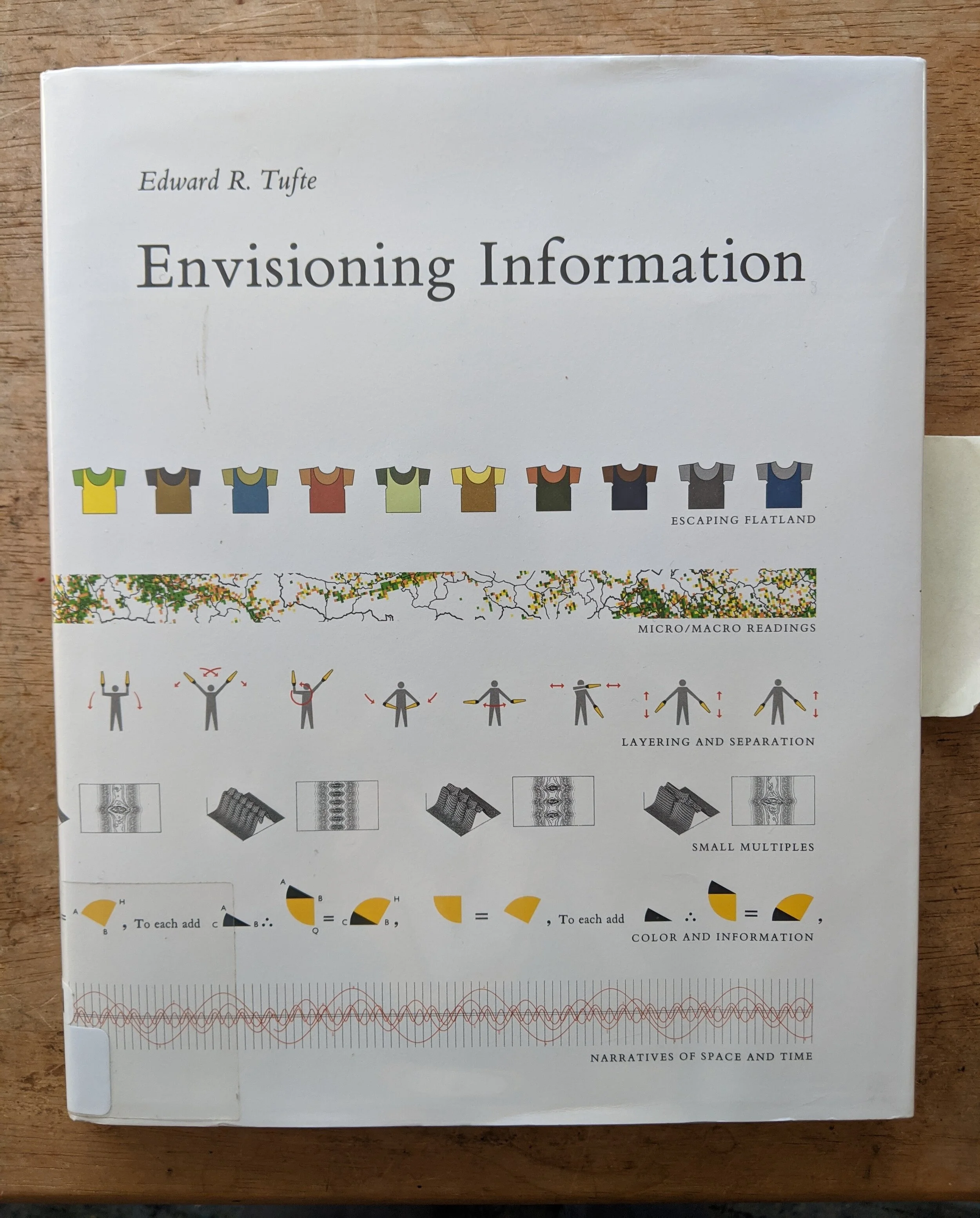
ENVISIONING INFORMATION - EDWARD R. TUFTE
I read this on the recommendation of my father. We were both complaining about PowerPoint, which in my view competes only with the car alarm for worst invention invented since my birth (my dad was born before the H-bomb so he probably can’t say the same), and he mentioned how Tufte has a theory that PowerPoint played an important role in the Challenger disaster. I read up on that, very interesting and persuasive, then decided to check out one of his books. The library had this one, but it’s one of those books it would be great to own. Not unlike how the very style and structure of something like A THOUSAND PLATEAUS offers itself as an example of what it’s getting at, ENVISIONING INFORMATION itself is laid out beautifully and flows better than almost anything I’ve ever seen. Tufte is focused on how much information one can pack into “flatland” which is his term (borrowed from that weird book about sentient triangles) for the flat page. Actually, his real obsession seems to be critiquing and tearing apart bad design. Tons of railway schedules and maps are, rather gorgeously, reprinted only to be picked over and found wanting. Like a lot of good critiques, some of Tufte’s best stuff is negative. The thing that really stuck with me was how omnivorous Tufte is when it comes to displays of information. Of course there are some really complicated railway timetables (surprise, surprise, the Japanese make the best ones) and maps, but there’s also discussions of how to notate dance (something that’s intrigued me for a while), different ways a series of Massachusetts pictographs have been reproduced over time, alternative layouts for the periodic table, how Galileo notated his discoveries, color interactions and more. There’s a very interesting segment about the Vietnam memorial, for instance. Tufte’s prose style is surprisingly gnomic and given to declarations. He’ll write things like, “Clutter and confusion are failures of design, not features of attributes of information.” Which are pithy and catchy but don’t strike me as true. He’s quick to make his point and move on, which allows this book to be so broad without being a million pages long. But the draw here, and the reason I’d love to own this book, is how beautifully the examples are reprinted and laid out. It’s one of those books you can read in an hour or so then dip into while stoned, just flipping through the charts and graphs and information displays, for years. Coffee table/art books are among my favorite type and a type of book I, someday, aspire to own hundreds of, when my nomadism settles and collecting such costly and unwieldy items is more reasonable. A boy can dream. The only other thing I’d say about this book is the strangeness of reading it now in an age of computers and phones. Tufte’s obsession about how to display information on a page, especially really complicated information, has taken on a totally new dimension now that it’s displayed digitally. Which is not to say that Tufte’s insights can’t carry over, many popular apps are appallingly designed (Instagram, an app that is supposedly centered around photography, won’t display the pictures on full screens, for instance),it just means you have to do some extrapolation to guess what he’d say about a current design issue. Either way, I’ll be keeping this book on the table for a while, until the full 3 weeks are up on the rental, and, fingers crossed, one day I’ll own it. 1948 graphs and charts.
